Ch5 15
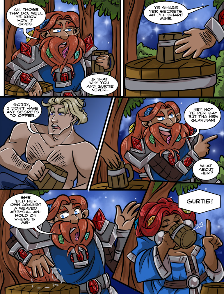
Alli’s trying out a new style of shading with this page. It’s a little jarring of a switch mid chapter, but it’s something she’s really happy with. Let us know what you think.
This chapter’s almost wrapped up. We’re getting towards the glorious reveal of Alli’s all-time favourite character from My Hero! Soon. Soon.

I like the new shading! And I love this comic (and loved and miss Out of my Element). Alli’s art is always fantastic.
…which makes me feel bad that I’m posting for the first time in a long time with a slight complaint. The line dividing panels one and two disappears into the lines of the tree trunks, so it took me about 3 read-throughs to realize there was a panel switch and track that the “camera” had shifted down and to the left. At first I thought that was Lark’s arm and he was talking to himself, and then I finally noticed the wonderfully bejewelled bracer and scanned back and realized what was going on. Perhaps adding a white line like between panels 3 and 4 would make it more quickly evident that there’s a panel break there and not one long panel across the top?
Hrmmm. Good point. We’ll separate the two a little bit more so it’s more obvious.
We’ve been working on the re-work of OoME – adding in more world building and more visual explanation of the Elementals and the like in the first few chapters. Alli has yet to put pen to paper, but we’re hoping that the reboot, after My Hero! is done, will make everyone happy. Who knows, if we can somehow find our groove again, we might be able to get both OoME and MH! updating simultaneously (Probably once a week each, mind you)
I think the text lines in the second and third bubbles on the first panel are switched around…
No wait, that’s not one panel. Confusing.
The new shading works well. I hope you don’t get rid of the stone effect for close up the beard for Gurtie’s husband that was really neat.
It’s still there. Just harder to see with this style! We might increase the opacity of the masking layer, but we don’t want to lose the shading effect. It’s an experiment in progress!
Either the opacity of the masking layer or the contrast a bit not sure which program you are working with so I can’t give advice. I still have CS2 on a old laptop that I use as a art laptop for when I do Photoshop. Otherwise my style is traditional with acrylics, inks, markers, and pencil as the mediums. Used to oils, but not as much anymore.
Alli is using CSP to sketch and ink. I think she is now using it to shade and colour, but effects like the stone masking layer are done in photoshop. We’ll fine tune it and re-do the stone layer on this page so it’s more visible. Shouldn’t be too hard.
I really like the new shading! I liked the old style too, so whatever is easiest go with it.
Thank you for your input, Diane! We always love to hear what our fans think of how our work is going. Even negative things help out, so don’t worry about telling us about things you don’t like, too! 😀
Damnit Gurtie!
Way to go, Gurtie! 😀
Probably ought to have had the full black-white-black border between the first two panels. I thought for a moment there were two Morridans.
Fixed! Awesome. Scans much clearer now.
Page fixed! Thank you everyone for the feedback!
Heh, almost missed that sneaky hand in panel four 😀
You know the rules Morri: any un-attended mug is free for the taking (and it’s rude to speak with your mouth full 😛 )